
Tutorial Details
-
Topic: RWD
-
Difficulty: Intermediate
-
Estimated completion time: 45 mins
Final Product What You’ll Be Creating

Pricing tables can be a very effective means of displaying information and helping users differentiate the options available to them. Ultimately, pricing tables can convert passing visitors into valuable customers, so it’s important we consider how they work on different screens and devices.
We’re going to make a fluid pricing table, then alter the way it’s displayed at different viewport sizes using media queries. Let’s get started!

Choosing a Responsive CSS Framework
We’re going to lean on a pre-existing framework in order to sort out our grid measurements and media queries. This isn’t vital, but will save us some time.
We have a couple of options here, most fundamentally between Adaptive and Responsive layouts.
-
Adaptive Layout: Using media queries we’d switch between a range of fixed layouts, working (in principle) perfectly for every device window size. But this is inflexible and might sometimes result in a layout displaying incorrectly between unusual window sizes.
-
Responsive Layout: Using a fluid basis, element widths would be specified in percentages instead of fixed pixel (or em) values. This affords us more flexibility for displaying on whatever device size we might be presented with and keeps things more future friendly.
I prefer the Skeleton Framework for creating responsive designs, but the default Skeleton framework uses a range of fixed layouts. Instead, I’m going to use a fluid version of Skeleton by Ian Yates, throughout this tutorial.

Step 1: Markup for Desktop Screens
Traditionally, when designing for a desktop computer or laptop we’ve relied on 960px as the standard width. For the sake of ease, that’s how we’re going to jump in here – so let’s see how we can design our pricing table for larger screens.
| 001
002 003 004 005 006 007 008 009 010 011 012 013 014 015 016 017 018 019 020 021 022 023 024 025 026 027 028 029 030 031 032 033 034 035 036 037 038 039 040 041 042 043 044 045 046 047 048 049 050 051 052 053 |
<!DOCTYPE html>
<!–[if lt IE 7 ]><html class=”ie ie6″ lang=”en”><![endif]–> <!–[if IE 7 ]><html class=”ie ie7″ lang=”en”><![endif]–> <!–[if IE 8 ]><html class=”ie ie8″ lang=”en”><![endif]–> <!–[if (gte IE 9)|!(IE)]><!–><html lang=”en”><!–<![endif]–> <head> <meta charset=”utf-8″> <title>Responsive Pricing Table</title> <meta name=”viewport” content=”width=device-width, initial-scale=1, maximum-scale=1″> <link rel=”stylesheet” type=”text/css” href=”css/base.css”> <link rel=”stylesheet” type=”text/css” href=”css/layout.css”> <link rel=”stylesheet” type=”text/css” href=”css/fluid_skeleton.css”> <link rel=”stylesheet” type=”text/css” href=”css/pricing_table.css”> </head> <body> <div class=”container”> <div id=’pricing_plan1′ class=”four columns”> <dl class=’plans’ > <dd class=”plan_title”> Basic </dd> <dd class=”plan_price”> $9.99 </dd> </dl> <dl class=’plan’ id=”one”> <dt class=’plan_more’>View<a href=”#one” class=”more_icon”></a><a href=”#” class=”less_icon”></a></dt> <dd class=”plan_features”> <div class=”feature_desc”><span class=”highlight”>1GB</span> Storage</div> </dd> <dd class=”plan_features”> <div class=”feature_desc”><span class=”highlight”>5GB</span> Bandwidth</div> </dd> <dd class=”plan_features”> <div class=”feature_desc”><span class=”highlight”>2</span> Domains</div> </dd> <dd class=”plan_features”> <div class=”feature_desc”><span class=”highlight”>3</span> Databases</div> </dd> <dd class=”plan_features”> <div class=”feature_desc”><span class=”highlight”>1</span> FTP Account</div> </dd> <dd class=”plan_features”> <div class=”feature_desc”><span class=”highlight”>25</span> Email Accounts</div> </dd> <dd class=”plan_buy”> <a href=” class=’buy’ >Buy Now</a> </dd> </dl> </div> </div> </body> </html> |
Initially we have to include all the necessary CSS files for Skeleton Framework and custom styles for the pricing table.
In this mockup I’ve included HTML for just one part of the pricing table (all the others are similar). You’ll have to create a container for your elements. In Skeleton you can assign class container to all the main containers. All the columns should go inside that element.
Skeleton divides the main container into 16 columns. I have used 4 columns each for the 4 pricing packages – check out the div with a class four columns.
For the data, I’ve used a simple description list to show the pricing package features.

Step 2: CSS for Large Screens
Let’s add some basic styles to improve the look and feel of the pricing table:
| 001
002 003 004 005 006 007 008 009 010 011 012 013 014 015 016 017 018 019 020 021 022 023 024 025 026 027 028 029 030 031 032 033 034 035 |
.plan_features:nth-child(odd){
background: none repeat scroll 0 0 #F7F7F7; font-size: 13px; font-weight: bold; padding: 10px 5px; } .plan_features:nth-child(even){ background: none repeat scroll 0 0 #fff; font-size: 13px; font-weight: bold; padding: 10px 5px; } .plan_price{ color: #FFFFFF; font-size: 35px; font-weight: bold; padding: 30px; text-align: center; } #pricing_plan1 .plan_price,#pricing_plan1 .buy{ background: none repeat scroll 0 0 #B71A1A; border-top: 1px solid #F83333; } #pricing_plan2 .plan_price,#pricing_plan2 .buy{ background: none repeat scroll 0 0 #1A7BB7; border-top: 1px solid #4BA3FF; } #pricing_plan3 .plan_price,#pricing_plan3 .buy{ background: none repeat scroll 0 0 #2D964B; border-top: 1px solid #5AD540; } #pricing_plan4 .plan_price,#pricing_plan4 .buy{ background: none repeat scroll 0 0 #909092; border-top: 1px solid #B1ACAC; } |
This first chunk styles the alternating zebra stripes for the data rows, gives each package a unique color scheme and sets some typographic rules.
| 001
002 003 004 005 006 007 008 009 010 011 012 013 014 015 016 017 018 019 020 021 022 023 024 025 026 027 028 029 030 031 032 033 034 035 036 037 038 039 040 041 042 043 044 045 046 047 048 049 050 051 052 053 054 055 056 057 058 059 060 061 062 063 064 065 066 067 068 069 070 071 072 073 074 075 076 |
.plan_title{
background: none repeat scroll 0 0 #000000; border-radius: 3px 3px 0 0; color: #FFFFFF; font-family: helvetica; font-size: 20px; font-weight: bold; padding: 20px; text-align: center; text-shadow: 1px 1px 1px #5E5858; } .plan{ border:1px solid #eee; margin-bottom: 15px; } .plan_buy{ background: none repeat scroll 0 0 #000000; border-radius: 0 0 3px 3px; padding: 20px; } .plan_buy a{ border-radius: 4px 4px 4px 4px; color: #FFFFFF; display: block; font-size: 15px; font-weight: bold; margin: auto; padding: 10px 5px; text-align: center; text-decoration: none; width: 90px; } .plan_more{ background: none repeat scroll 0 0 #fff; font-size: 13px; font-weight: bold; padding: 10px 5px; display: none; border-left: 2px solid #302C2C; border-right: 2px solid #302C2C; border-bottom: 2px solid #302C2C; } .more_icon{ background-image: url(“../plus_minus_icons.png”); background-position: 25px -3px; float: right; height: 25px; width: 25px; } .more_icon:hover{ cursor: pointer; } .less_icon{ background-image: url(“../plus_minus_icons.png”); background-position: 0px -3px; float: right; height: 25px; width: 25px; } .less_icon:hover{ cursor: pointer; } .plan_features img{ float:left; } .feature_desc{ color: #4E4E4E; font-family: arial; text-align: center; } .highlight{ color: #333233; font-family: helvetica; font-size: 15px; font-weight: bold; } |
The remaining styles pretty things up, but also deal with some icons which we’ll use on smaller screens. As you can see, .plan_more has a display: none; set, so it’s invisible at larger screen sizes, even though we’ve styled the icon within it.
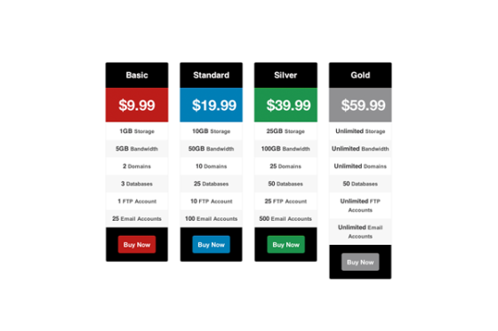
The image below shows how the pricing table displays on large screens.


Step 3: Designing for Tablets
It’s dangerous to start defining screen sizes in terms of devices (the fact is, we never know with certainty what device is being used to view our page) but, normally, tablets will have a screen width between 768px and 959px. To accommodate for this assumption, we’ll write a media query to deal with the necessary styles.
In its currrent state, the demo will display perfectly on tablet screens with reduced width. Therefore I won’t code any custom styles for tablets. In our Skeleton framework, the media queries section for tablets will look like this (a bit empty):
| 001
002 003 004 005 |
/* #Tablet (Portrait)
================================================== */ /* Note: Design for a width of 768px */ @media only screen and (min-width: 768px) and (max-width: 959px) { } |
The image below shows how the pricing table displays on “tablet” screens:

Step 4: Portrait Mobile Screen
Okay, so we’ve designed the pricing table for larger screens. Now we’ll look at portrait mobile screens which is as small as we’re going to worry about in this tutorial. Since it will be around 320px wide we won’t be able to completely display even a single package in the screen. We are going to have to plan a different layout for tiny screens based on the following:
-
Convert the price and title of the pricing package into one row instead of two separate rows.
-
Hide all the features and display View Features navigation panel.
-
Show the features list using CSS techniques once View Features buttons are clicked.
First let’s take a look at our initial HTML structure for the pricing table we laid out in Step 1. Remember the section with the class plan_more which is hidden in the default wide screen view? We’ll use this as the View Features navigation.
Check out the styles for screens between 320px and 767px wide:
| 001
002 003 004 005 006 007 008 009 010 011 012 013 014 015 016 017 018 019 020 021 022 023 024 025 026 027 028 029 030 031 032 033 034 035 036 037 038 |
@media only screen and (min-width: 320px) and (max-width: 767px) {
.plan_title{ width:45%; float:left; border-radius:3px 0 0 0; } .plan_price{ width:55%; padding:20px 2%; border-top:none !important; float:left; } .plan_more{ display: block; clear: both; } .plan_buy{ padding: 10px; } .plan > dd { height: 0; overflow: hidden; padding:0 !important; opacity: 0; filter: alpha(opacity=0); /* IE6-IE8 */ -webkit-transition: opacity 0.9s ease-in-out; -moz-transition: opacity 0.9s ease-in-out; -o-transition: opacity 0.9s ease-in-out; -ms-transition: opacity 0.9s ease-in-out; transition: opacity 0.9s ease-in-out; } .plan:target > dd{ padding: 10px 5px !important; height: auto; opacity: 1; filter: alpha(opacity=100); /* IE6-IE8 */ } } |
We assign custom widths for title and price elements and set the float: left in order to convert both sections into a single row. Then we show the View Features section by assigning display:block to theplan_more class. It will contain plus and minus icons for opening and closing the features.
Once the user clicks on plus icon we have to slide the features list and display into the screen. Even though it can be done easily by using jQuery, we are going to look for a CSS-based solution to avoid scripts.
I’m going to use the CSS technique demonstrated by Ian Yates in Quick Tip: Give Orman’s Navigation the :target Treatment. First we set the height of all the features to 0 to hide them. Then we assign some browser specific CSS transition codes to get the sliding effect.
Once the plus button is clicked we can get the target element using the fragment identifier within the url. We display the features on the clicked package by setting the height. Simple.
Now when you switch to smaller mobile screens you will get the layout with titles and pricing of every package. Use the plus and minus button to display and hide the features.

The following image shows you how features are displayed when you expand them using the navigation buttons:


Step 5: Landscape Mobile
Again, we’re generalizing, but we’ll assume landscape layout of mobiles are specified between 480px and 767px. Since we are using a column based layout, our pricing table displays properly in mobile landscape screen without performing any changes. Take a look:

As you can see, one package is displayed in full width. We don’t really need such space for a single package. This is another important thing you need to consider in responsive design. First we’d like to make sure that all the contents can be browsed without scrolling. Then we need to optimize the layout to provide a solid user experience.
In principle, this landscape mobile width can contain two packages of our pricing table. So let’s play with some CSS inside the media queries for landscape mobile layout section
| 001
002 003 004 005 006 007 008 009 010 011 012 013 014 015 016 017 018 019 020 021 022 023 024 025 026 027 028 029 |
@media only screen and (min-width: 480px) and (max-width: 767px) {
#pricing_plan4,#pricing_plan3,#pricing_plan2,#pricing_plan1{ width: 50%; } .plan_title{ width:auto; float:none; border-radius: 3px 3px 0 0; } .plan_price{ width:auto; float:none; border-top: 1px solid #F83333; } .plan_more{ display: none; } .plan > dd { padding: 10px 5px !important; height:auto; opacity: 1; filter: alpha(opacity=1); /* IE6-IE8 */ -webkit-transition: opacity 0.9s ease-in-out; -moz-transition: opacity 0.9s ease-in-out; -o-transition: opacity 0.9s ease-in-out; -ms-transition: opacity 0.9s ease-in-out; transition: opacity 0.9s ease-in-out; } } |
We’ve given pricing packages a width of 50% and hence we will be able to view two packages instead of one package in the default layout.
I have used some custom styles for plan price and plan title, but the important thing to note is that float is set to none. Initially we didn’t have any floats, but in the Portrait mobile layout we needed to set them. This is used to clear those floats for Landscape mobile screen.
We don’t want the View Features section in this layout. So display:none is used on the plan_more class to hide the section.
Then we need the features to display automatically. All the features are given an auto height using the CSS technique described in the previous section.
So then! We have completed the layout design for different devices with different screen sizes. You should have something which looks like this:


<div> vs. <table>
The sharper among you will notice that we’ve used a div-based layout with description lists, even though we’re dealing with tabular data. We could have easily gone with a responsive table design for this tutorial, such as Chris Coyier demonstrates in this article.
Sure, we should think about making the design responsive, but we should also consider the type of data used in the design. Generally, related data is displayed in table rows; we get information about an entity by reading a single row. However, in our scenario, related data is displayed within a single column. If we were to use a table then display it using Chris’ responsive technique we would get a layout like the one shown below:

All the prices are displayed with the package names at top. Then the storage capacity of each package is displayed with the package names. So to get information about any single package you’d have to scroll to the end. Considering this scenario I choose not to go with table based design.

Wrap Up
Throughout this tutorial we learned how to create a responsive pricing table to suit all kind of devices. Thank you for reading and good luck with your responsive pricing tables!
Tutorial provided by: webdesign.tutsplus.com
 My SXU Website